Accordions let users expand and collapse sections of content.
A bento menu, named after bento boxes, represents a menu with grid items.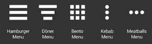

Pretty common around interfaces today, comments display content users input into the system in chronological order. You’ve seen them around social media engines and on blog posts.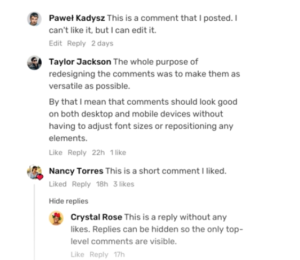
This controversial UI element allows users to select an item from a list that “drops down” once they click on it. 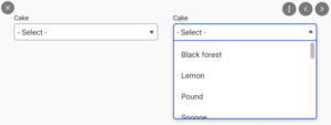
Feeds display user activity in chronological order. The content varies and can range from simple text to images to video. Think Twitter or Instagram.

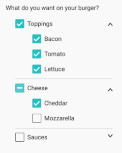
Forms help users input sets of related information into the system and submit them.
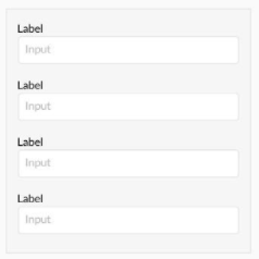
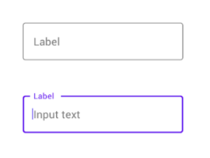
Input fields are, quite simply, a place for users to enter content into the system. They aren’t just limited to forms, either—search bars are input fields as well.
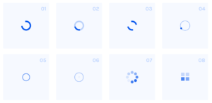
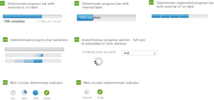
Loaders can take on many, many forms—designers enjoy getting creative with them. Loaders are designed to let users know the system is completing an action in the background and should wait.
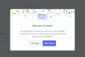
A modal window is a small box containing content or a message that requires you to interact with it before you can close it and return to your flow.
Think of the last time you deleted an item on your phone. The little message that popped up asking you to confirm that you wanted to remove it is a modal.
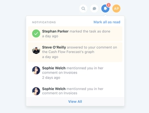
Notifications let users know there is something new, like a message, for us to go check out.
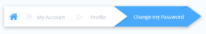
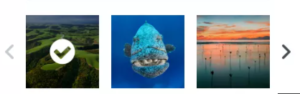
Typically found near the bottom of a page, pagination organizes content into pages. Pagination lets users know where they are within a page and click to move into other sections.
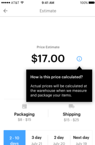
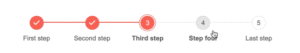
Progress bars help users visualize where they are in a series of steps. You’ll commonly find them on checkouts, marking the different stages a user needs to complete to finalize a purchase, like billing and shipping.
Users can only choose one option and not multiple options like they can with checkboxes.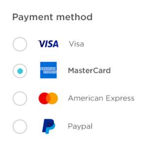
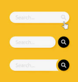
Commonly represented as an input field with a little magnifying glass inside of it, search fields allow users to input information to find within the system.
A sidebar displays a group of navigational actions or content literally on the side of a page. It can be visible or tucked away.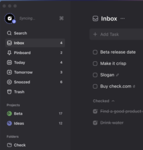
Sliders are a common UI element used for selecting a value or a range of values. By dragging the slider with their finger or mouse, the user can gradually and finely adjust a value—like a volume, brightness, or desired price range when shopping.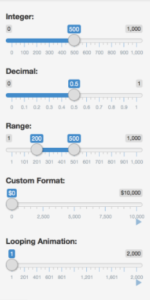
Steppers are two-segment controls that also let users adjust a value. However, unlike sliders, they allow users to alter the value in predefined increments only.
In UI design, tags are essentially labels which help to mark and categorize content. They usually consist of relevant keywords which make it easier to find and browse the corresponding piece of content. Tags are often used on social websites and blogs.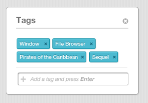
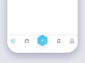
Tab bars appear at the bottom of a mobile app and allow users to quickly move back and forth between the primary sections of an app.
Tooltips provide little hints that help users understand a part or process in an interface.